
The Psychology of Food Packaging: Why the Container Changes How Food Tastes
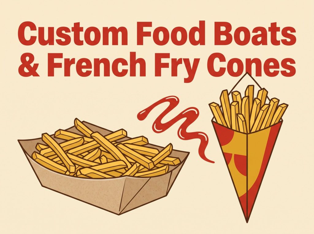
Here is an uncomfortable truth for anyone who sells food: your customers do not taste your food objectively. They taste it through everything surrounding it the smell, the setting, the price, and yes, the container it arrives in. Research in sensory science has shown repeatedly that presentation shapes perceived flavor. The same fries taste better from a container that looks intentional.
For food businesses, this is not trivia. It is a lever most owners never pull.
First Impressions Happen Before the First Bite
Diners judge food in the seconds between receiving it and tasting it. In that window, the packaging is the meal. A flimsy, generic tray whispers “mass-produced.” A sturdy, well-designed one says “someone cared about this.”
Studies on expectation and taste have found that people rate identical food higher when it arrives in packaging they perceive as higher quality. The food never changed. The frame did.
Color Sets the Flavor Expectation
Color psychology runs deep in food. Warm reds and yellows signal indulgence and speed the palette of nearly every major fast-food brand. Kraft brown signals natural, honest, handmade. Black and gold signal premium. White signals clean and modern.
The practical lesson: your packaging color should match the story your food tells. A gourmet smash burger in a neon carnival tray sends mixed signals. The same burger in matte kraft with a simple stamped logo feels like it costs two dollars more and customers happily pay it.
The Instagram Effect Is Real Revenue
Modern diners photograph food before eating it. That habit turned packaging into a media channel. A visually distinctive container gets photographed and shared; a plain one does not. Every shared photo is an endorsement delivered to an audience that trusts the sender.
This is why brands with iconic packaging get free publicity every day. Smaller businesses can play the same game at their own scale. Suppliers such as Prefine Packaging let even small vendors print full-color designs on trays and cones at low minimums, which means the “Instagram-ready” advantage is no longer reserved for chains with massive budgets.
Weight and Texture Speak, Too
Sensory researchers have found that heavier, sturdier containers increase perceived quality of the contents. Texture matters as well: a slightly textured kraft surface reads as artisanal, while glossy smoothness reads as commercial. Neither is wrong but each tells a different story. Choose the one that matches your menu and price point.
Consistency Builds Memory
A single great impression is nice. Repetition builds a brand. When your colors, logo, and packaging style stay identical across every order, customers begin to recognize you at a glance. Recognition builds trust, and trust shortens the decision at the counter. This is the entire mechanism behind why chains obsess over food packaging standards and it works at any size.
Putting It Into Practice
Start with three questions:
- What should my food’s container say about my food fast and fun, natural and honest, or premium?
- Does my current packaging say that, or does it say nothing?
- Would a customer photograph this?
If the honest answers disappoint you, packaging is likely the highest-return fix available to your business. It touches every single order, it costs cents per unit, and it works silently on every customer before they take a single bite.
The container was never just a container. It is the first course.